# UI Sketch
**Language:** English · [한국어](#한국어) · 📖 [Full docs](https://jkraccoon.github.io/obsidian-ui-sketch/) · [한국어 문서](./docs/ko/README.md)
[](./LICENSE)
[](https://obsidian.md)
[](https://github.com/sponsors/jkRaccoon)
[](./tests)
> **Sketch web UI wireframes from human-readable YAML — rendered inline in your Obsidian notes. 44 components. AI-friendly structure. Theme-adaptive.**
>
> **사람이 읽기 쉽고 AI가 다루기 좋은 YAML로 웹 UI 와이어프레임을 그려서 Obsidian 노트 안에 바로 렌더링합니다. 컴포넌트 44개. AI 친화 구조. 테마 자동 적응.**
---
## Why this exists
Product specs, design briefs, RFCs, kickoff docs — when planners and UI/UX designers describe a screen in markdown, they reach for ASCII boxes:
```text
+---------+------------------+
| Header | Actions |
+---------+------------------+
| Sidebar | Body |
| | |
+---------+------------------+
```
Slow to draw. Painful to edit. Easy to misalign. And worst of all, **the structure is gone the moment you type it out**. To your eyes it's a header with a sidebar; to anything trying to read it — a teammate skimming, a script parsing, an LLM rewriting — it's just `String.split('|')`.
That last reader matters more than ever. A growing share of product writing now happens with an AI in the loop: co-drafting the spec, asking the model to revise a layout, generating screen variants from a brief. **AI is excellent at reasoning over structured data and miserable at decoding ASCII rectangles.** Your spec ends up being two things at once — a picture humans can almost read, and a string the model can't understand. Neither audience is well served.
**UI Sketch is one simple trade.** Stop drawing the UI in text. Describe it in YAML instead:
```yaml
screen:
- navbar: { brand: "DocHub" }
- row:
items:
- col: { flex: 1, items: [ { sidebar: { items: ["Home", "Docs"] } } ] }
- col: { flex: 3, items: [ { card: { title: "Welcome" } } ] }
```
One source. Three audiences:
- **Humans skim it in seconds.** YAML reads like an outline, not a maze of pipes and dashes. You can see the layout without rendering it.
- **AI consumes it as data.** Every screen, component, and prop is addressable. Models can mutate, validate, diff, generate variants — no decoding step.
- **Readers see a real wireframe.** Flip to reading view and the same YAML renders as a mid-fi frame, in your Obsidian theme. No mental reconstruction.
That's the whole pitch. Anywhere you'd otherwise reach for an ASCII sketch — spec docs, design briefs, RFCs, AI-assisted product threads — you get a single artifact that you, your reviewers, and your tools can all edit.

---
# English
## See it in action
Drop this in a ` ```ui-sketch ` fenced block, switch to Reading view, and the wireframe appears inline.
```yaml
viewport: desktop
screen:
- navbar: { brand: "DocHub", items: ["Home", "Docs", "Pricing"] }
- row:
gap: 16
items:
- col:
flex: 1
items:
- sidebar: { items: ["Getting Started", "API", "FAQ"] }
- col:
flex: 3
items:
- heading: { level: 1, text: "Welcome back" }
- row:
gap: 12
items:
- card: { title: "Tasks", body: "12 open" }
- card: { title: "Docs", body: "3 drafts" }
- button:
label: "New document"
variant: primary
note: "Navigates to /documents/new"
```
A single `viewport:` key flips between desktop, tablet, and mobile:
|
**`viewport: mobile`** — a 375px login form ([recipe](./docs/recipes/login-form.md)):

|
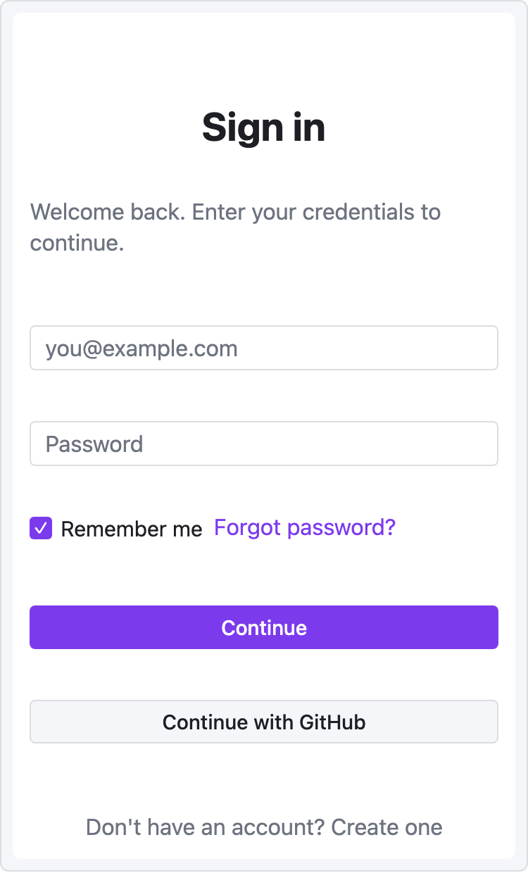
**`viewport: desktop`** — a named-area grid dashboard ([recipe](./docs/recipes/dashboard.md)):
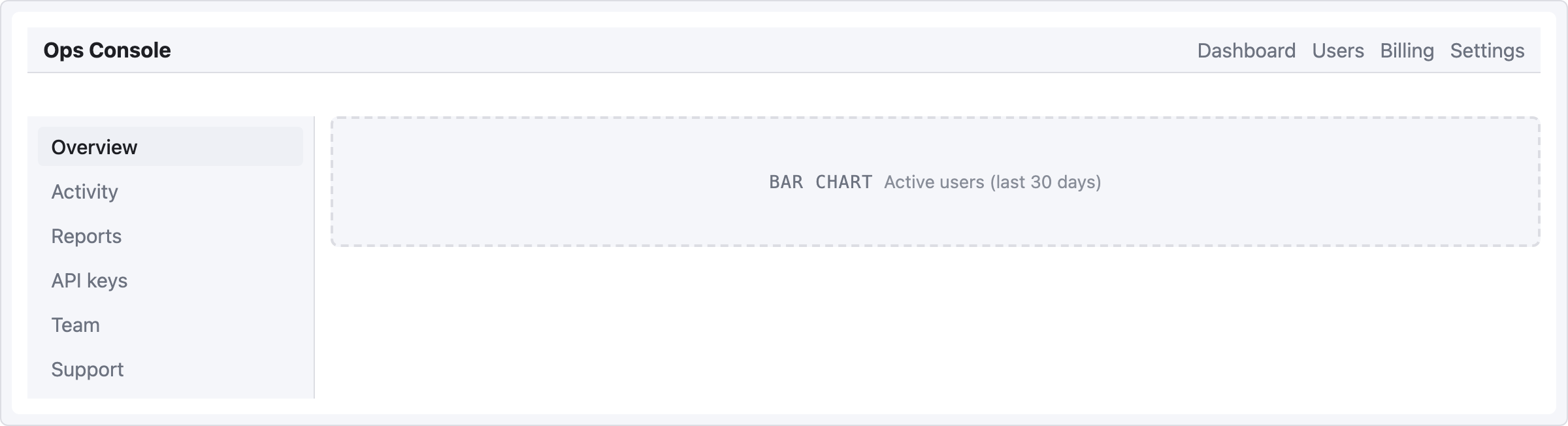
|
## What you trade ASCII for
| Pain | Before (ASCII) | After (UI Sketch) |
|---|---|---|
| Aligning columns | `│ Header │ Actions │` gymnastics | `- row: { items: [...] }` |
| Tweaking layout | Retype the entire diagram | Edit one line of YAML |
| Reading someone else's sketch | Decode what the boxes meant | Render it and see |
| Keeping vault consistent with theme | Manual color adjustments | Uses Obsidian CSS variables automatically |
| Asking an LLM to revise the layout | Paste an ambiguous picture | Paste structured YAML |
- **Mid-fi by design.** Not a Figma replacement — a *fast sketching* tool that lives in your notes.
- **Theme-adaptive.** Light, dark, and community themes inherit via `var(--interactive-accent)` and friends.
- **Friendly errors.** YAML typo? Red box with the exact line. Unknown component? Levenshtein-based suggestion.
- **Safe.** Depth and node-count caps prevent runaway blocks. The `raw:` escape hatch runs through `sanitize-html` — no XSS surface.
- **Zero runtime state.** Every render is a pure function from YAML to DOM. No surprises in Live Preview.
## Quick start
### 1. Install
**One-click from Obsidian Community (recommended)**:
1. Open the plugin page: **[community.obsidian.md/plugins/ui-sketch](https://community.obsidian.md/plugins/ui-sketch)**.
2. Click the **Add** button — Obsidian opens and installs UI Sketch automatically.
3. Enable **UI Sketch** under Settings → Community plugins.
**From inside Obsidian** — Settings → **Community plugins** → **Browse** → search `UI Sketch` → **Install** → enable.
**Pre-release / dev build (BRAT)**:
1. Install the [BRAT](https://github.com/TfTHacker/obsidian42-brat) community plugin.
2. BRAT → "Add Beta plugin" → `jkRaccoon/obsidian-ui-sketch`.
3. Enable **UI Sketch** in Community plugins.
**Manual install**:
1. Download `main.js`, `manifest.json`, and `styles.css` from [the latest release](https://github.com/jkRaccoon/obsidian-ui-sketch/releases). Release assets are signed with [GitHub artifact attestations](https://docs.github.com/en/actions/security-for-github-actions/using-artifact-attestations/using-artifact-attestations-to-establish-provenance-for-builds); verify with `gh attestation verify main.js --repo jkRaccoon/obsidian-ui-sketch`.
2. Copy them into `/.obsidian/plugins/ui-sketch/`.
3. Enable the plugin in Settings.
### 2. Write your first sketch
In any note, add a fenced code block tagged `ui-sketch`:
````markdown
```ui-sketch
screen:
- navbar: { brand: "MyApp" }
- button: { label: "Sign in", variant: primary }
```
````
Switch to Reading view (`Ctrl/Cmd+E`). You'll see a rendered wireframe.
### 3. Go deeper
Full documentation lives in [**`docs/`**](./docs/README.md):
- [Getting Started](./docs/getting-started.md) — a 5-minute tutorial
- [YAML Reference](./docs/yaml-reference.md) — complete syntax
- [Component Reference](./docs/components/README.md) — prop tables and examples for all 44 components
- [Recipes](./docs/recipes/dashboard.md) — copy-paste templates for common screens
- [Troubleshooting](./docs/troubleshooting.md) — error levels and common fixes
## Component catalog
**44 components in 8 categories, plus one escape hatch.** Every component accepts the base props (`id`, `w`, `h`, `align`, `pad`, `note`, `muted`) on top of its type-specific props. Detailed prop tables live in the [Component Reference](./docs/components/README.md).
| Category | Components |
|---|---|
| [**Layout structure**](./docs/components/layout.md) | `container` · `card` · `panel` · `divider` · `spacer` |
| [**Navigation**](./docs/components/navigation.md) | `navbar` · `sidebar` · `tabs` · `breadcrumb` · `pagination` · `stepper` |
| [**Basic input**](./docs/components/input-basic.md) | `button` · `input` · `textarea` · `select` · `checkbox` · `radio` |
| [**Advanced input**](./docs/components/input-advanced.md) | `toggle` · `slider` · `date-picker` · `file-upload` · `search` |
| [**Display**](./docs/components/display.md) | `heading` · `text` · `image` · `icon` · `avatar` · `badge` · `tag` · `kbd` |
| [**Feedback**](./docs/components/feedback.md) | `alert` · `progress` · `toast` · `modal` · `skeleton` |
| [**Data**](./docs/components/data.md) | `table` · `list` · `tree` · `kv-list` |
| [**Placeholder**](./docs/components/placeholder.md) | `chart` · `map` · `video` · `placeholder` |
| [**Escape hatch**](./docs/components/raw.md) | `raw` (sanitized HTML) |
A few examples:
```yaml
alert:
severity: warn
title: "Heads up"
message: "Review before committing."
table:
columns: ["Name", "Role", "Status"]
rows:
- ["Ada", "PM", "✓"]
- ["Ben", "ENG", "…"]
tree:
items:
- label: "src"
children:
- { label: "main.ts" }
- { label: "types.ts" }
- { label: "docs" }
kbd:
keys: ["Ctrl", "K"]
```
## YAML structure
See the [**YAML Reference**](./docs/yaml-reference.md) for complete syntax. Quick overview:
```yaml
viewport: desktop | tablet | mobile | custom # default: desktop (1200px)
width: 375 # custom only
height: 640 # custom only
theme: adaptive # v0.2 only supports "adaptive"
background: default | muted | transparent
screen: # required: array OR grid
- ...
```
Two layout models, mutually exclusive at the root:
**Flex (row/col nesting)** — primary model, fits 99% of web UIs:
```yaml
screen:
- row:
gap: 12
items:
- col: { flex: 1, items: [ { sidebar: {...} } ] }
- col: { flex: 3, items: [ ... ] }
```
**Named-area grid** — for dashboard layouts:
```yaml
screen:
grid:
areas:
- "nav nav nav"
- "side main main"
- "side foot foot"
cols: "180px 1fr 1fr"
rows: "56px 1fr 48px"
map:
nav: { navbar: { brand: "MyApp" } }
side: { sidebar: { items: ["Home", "Docs"] } }
main: { card: { title: "Welcome" } }
foot: { text: { value: "© 2026" } }
```
## Error handling
UI Sketch never fails silently. Every problem gets surfaced with something actionable.
| Level | When | Result |
|---|---|---|
| **L1** YAML parse error | Malformed YAML | Full-block error box with line/col |
| **L2** Structure error | Missing `screen`, unknown viewport, etc. | Full-block error box with path |
| **L3** Component error | Unknown component type or invalid props | Inline error box at that component's position — rest of the wireframe still renders |
| **L4** Empty block | No content | Friendly placeholder with a starter example |
**Typo suggestions** (Levenshtein distance ≤ 2):
> ⚠ `butn`: unknown component type · Did you mean "button"?
**Safety caps**:
- Max tree depth: **32**
- Max node count: **5000 per block**
- `raw:` HTML always runs through `sanitize-html` — no `